I’ve been playing with WPF. I’ve seen some good talks and demos of quite beautiful user interfaces and wanted to start getting some practical experience. I’ve also read a lot about the MVVM pattern which sounds like it gives a clean, easily understood separation of display and code, reducing those moments when you look at something and have to ask “should this be in the model or the controller/presenter?”
So new project. I’m going to write Noughts and Crosses. On a computer. Because no-one’s ever done that before!
Ok, so not very original but the point was to give a well understood requirement for which I could write various implementations, trying different techniques and comparing them. I’m trying to suppress any mad ideas of writing a networked, multi-threaded AI that will learn from previous games how not to lose when playing Global Thermonuclear War, for now just focus on the user interface and how that’s separated from the underlying logic.
So I started with a model: Game/Board/Square/Player, building them up with unit-tests, getting my TDD mojo going, red/green/refactor.
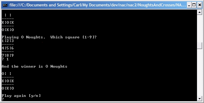
Then I wrote the first UI. Only 150 lines, most of them Console.Out.WriteLine, on top of the model classes from earlier. Woo! It looks like this:
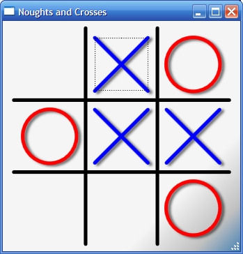
So now for something prettier, a little more modern. 200 lines this time, 50 of them the Xaml, the rest in the view-model class. But most of the time was spent playing with WPF and looking up how to do a drop-shadow. This one looks a little better:
Which one would you play?
So what have we learned?
An attractive modern UI can be built just as quickly as a command-line app with modern tools.
With patterns popularised in the developer community a rich UI does not mean the application has to be less maintainable.
Most developers have no colour sense and really need to get a graphic designer to help polish the look of their applications.


1 Comment
Later post taking the same game into Silverlight