Old Navigation Metaphors
Scrolling

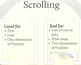
Scrolling is great when you have little structure, just a list or a piece of text. In particular it’s only good if the extension is in one direction – if you only have to scroll up and down (traditional text editor or web-page display) or left and right (new Microsoft Windows Phone 7 display) but not both. For mostly text this works well because we are used to text wrapping to defined columns in books and newspapers so extending this to the computer screen left natural.
But for an image or a map where you need freedom to move in all directions it’s hard to manage. Extensions like a grab-hand to move the content about (like Acrobat) or pan mode (like most web-browsers on middle-mouse-click) work but are either slow or don’t feel direct enough, often either being laggy or the amount of pan for a given mouse move feeling unconnected.
Whenever we hit an image that’s too big in a webpage or a sideways scrolling section on in iTunes listing in an otherwise vertically scrolling page is a shock as we’re suddenly broken out of the one-dimensional scrolling metaphor into a partially 2-dimensional space which we have to switch to new tools to navigate.
Paging
Paging is better for some types of data. Modern eBook readers have taken the pages from physical books and replicated them on the screen. While this initially seems unnecessary for many types of books like text books or children’s books with a mixture of pictures and images keeping the original page structure keeps the intended layout which is important for conveying the original message. Even for novels where a stream of text would seem just fine we’re so used to the page structure and the rhythm of the page-breaks in a book that reading long passages online in a single continuous stream feels wrong, and lessens the impact as after a while we’re just reading to get to the end of the chapter and not assimilating the meaning.
But mixing paging with scrolling doesn’t work. Because the internet is viewed on multiple devices and the publisher has no control over the screen size scrolling cannot easily be avoided. This makes news-stories split onto multiple pages feel wrong and having to both scroll and clicking through multiple pages for another couple of paragraphs annoys people, especially when we suspect it’s just to increase the advertising revenue for unique pages.
Zoom – A New Navigation Metaphor


Zooming has always had a minor place in computer applications: image editors allow you to get a close look up at small details, text editors allow you to jump to a bigger font for easier reading. But it is starting to find a place as a serious contender alongside scrolling and paging and changing how we structure content as a result.
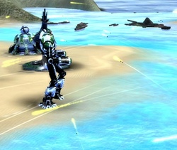
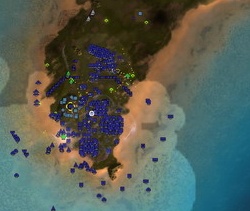
Many games use the mouse-wheel to zoom. Third-person action games move the camera closer to the action or back to see the whole area. Real-time strategy games zoom in to watch the firepower of a single unit and back out to an aerial view or even back the whole strategic map. These have always felt natural, zooming in and out around the point of focus, around the mouse cursor.

For a large canvas like a game’s strategy map this allowed instant navigation to any point of interest. Zoom way out until you see what you want at the edge of the screen then point at that and zoom in again. Note that this separated moving the user’s view from changing any selected context, effectively letting you keep track of one thing but having a quick look at anything else of interest.
Early mapping sites on the internet had static maps, and allowed zooming with special controls to jump to the maps at the next scale but with each level being of of radically different styles from various sources. Google Maps and Google Earth blew users away, suddenly allowing us to zoom in and out naturally, with the images being stretched until the next scaled imaged was ready, and the images matching each other in the same style but with more local detail.

Microsoft followed Google with Bing Maps and being Microsoft they tried to use this Deep-Zoom technology for other things, the fun example being the searchable display at memorabilia.hardrock.com.
This shows the possible use of zoom to other data, allowing the visual side of our brain to get involved selecting and examining things. Our brains have a large amount of wetware just for understanding what we see in the world. This combined with our appreciation of spatial relationships, colour, hierarchy allow rich displays using a large canvas to show both large scale overviews and zoom into layer upon layer of detail.

Too often mainstream application still use zoom badly if at all. It only works if it’s fast, smooth and zooms where the user expects.
Google Chrome for example gets it very nearly right: Ctrl+mouse-wheel zooms instead of scrolling which is a nice compromise; zooms smoothly and fast. But the zoom is centred somewhere in the top-left corner of the page so what you wanted, what you were pointing at, quickly zooms out of site leaving the user frustrated.
New tools are emerging bringing this idea into new areas, allowing our built-in ability to see relationships to make us better understand connections between data and ideas. One recent example is Prezi using a large canvas, zoom, scale and position to express information instead of a static set of bullet-pointed slides.
New development tools are allowing us to present data in far richer ways than ever before with use of colour and animation. This may be the next step, zooming through large hierarchical datasets may gradually become common allowing unseen features to be seen by being able to change our point of view from the large to the detailed at the flick of a wheel.
Zoom as a Primary Navigation Metaphor as a presentation on Prezi
1 Comment
I might have guessed you would graduate from Total Annihilation to Supreme Commander 🙂 When I first played SC I expected to have to keep “adjusting” the centre point but it works remarkably well. I’m going to have to check out this Memorabilia display now…